LFW AW26 - Art Hearts - Highlights and Standout Menswear Looks
- Yelyzaveta Kartavenko
- Mar 18
- 3 min read
Updated: Mar 19

There is something energising about arriving at a London Fashion Week show while the city carries on as usual - people cutting through Hyde Park, rushing to escape the rain, the tube packed as always. No one expects London to slow down for fashion week. Inside St John’s Church, though, the atmosphere definitely shifts. Art Hearts Fashion feels approachable, but the runway still carries weight. The concept is straightforward: a curated showcase of designers from different countries, sharing one stage. The church setting gives the show focus. The space allows the clothes to stand on their own. On Saturday 21 February, the AW26 showcase moved through six collections in a clear order: from streetwear, to tailoring, to sharper conceptual pieces, and back to graphic-heavy looks to close.
Cross Colours - USA
Cross Colours opened with bold graphics and strong 90s streetwear references. The brand’s identity is closely tied to social messaging, and that came through immediately in the styling. The silhouettes were relaxed and oversized, designed to move and to be noticed. Text elements and prints carried much of the visual impact, which gave the look a strong presence on the runway. The opening worked because it was direct, keeping the message clear from the start.

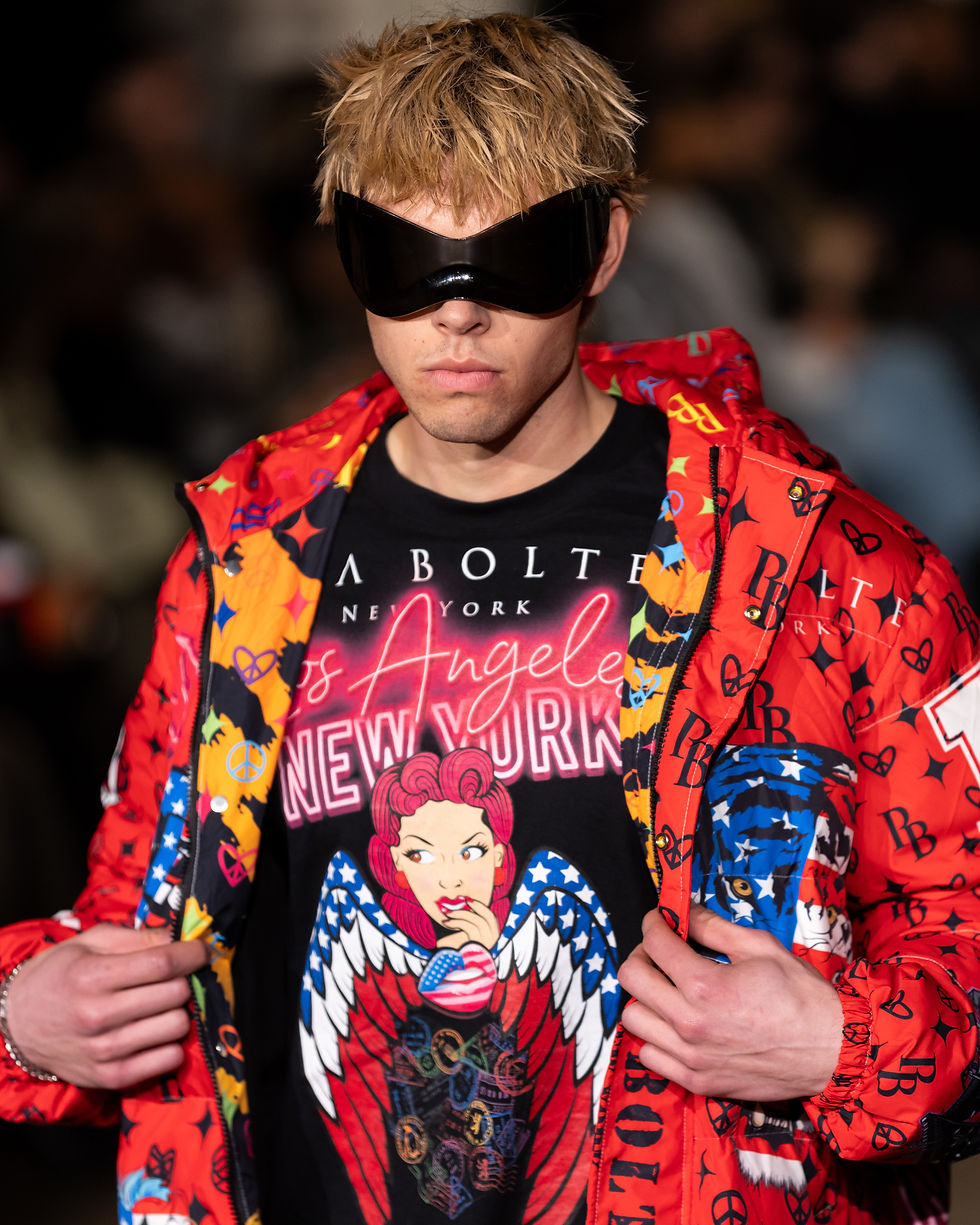
Pia Bolte - Germany
At first, Pia Bolte’s collection started off as minimalist and gradually became more experimental as the show went on. The silhouettes were structured and precise, with an emphasis on proportion and sharp tailoring. It leaned into a more contemporary vibe without feeling trend-driven. The impact came from cut and balance rather than embellishment. These were pieces that looked just as relevant beyond the runway as on it, and left a clear impression of confidence.
David Tupaz - USA
David Tupaz introduced a change toward refinement. The focus here was craftsmanship. Each piece appeared carefully constructed, designed to look composed from every angle. All silhouettes felt controlled and not overly excessive. The collection came across as very well considered - fashion suited to an occasion, without feeling rigid. Clean lines and careful finishing showed how the garments could speak without relying on a single standout piece.

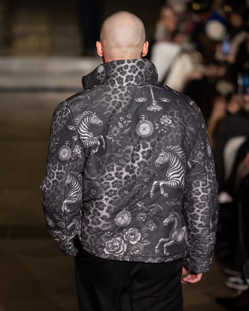
Bad Pink - Chile
Bad Pink marked a change in tone. The energy shifted toward something sharper and more confrontational. Instead of polished elegance, the focus was on attitude. The styling suggested a brand interested in standing out rather than blending in. After the more restrained collection before it, this contrast was very noticeable. The collection definitely added a different dimension to the showcase, widening the visual range of the afternoon.

Haus of Harleen - USA
Haus of Harleen followed with a collection that felt referential. Western cues are reworked into contemporary, wearable tailoring. The collection felt practical in the best sense - clothes designed to move with the body, but still sharp enough for a runway. There was clear consistency throughout the collection, a recognisable identity and confident tailoring, allowing it to flow from start to finish.

Mister Triple X - USA
After Cross Colours opened with social weight, there was something unbothered about Mister Triple X. Bold graphics don't need to justify themselves. It was a deliberate contrast to the opener, and it worked because of that. This segment leaned into strong branding and visual energy. As a closer, it worked, bringing the tempo back up and ending the show on a clear note.
Overall, the showcase felt well-paced. Each collection had space to register, and the shifts between them kept the runway very different but connected at the same time. Streetwear set the tone, tailoring sharpened it, sharper pieces introduced contrast, and the closing looks brought the energy back up again. Six different perspectives, one cohesive runway. That was the strength of it.
All Images Courtesy of IDEA PR
Written by Yelyzaveta Kartavenko
Edited by Abbey Villasis, Co-Fashion Editor


Comments